
• MAP ICONS •
(For Google Maps)
To use the map icons on this site, have the Google "My Map" you're working on open in a browser. You must click the red "EDIT" button in order to go into editing mode, which allows you to change descriptions and icons for your map points. Have another instance of your browser open with my icon page so that you can switch back and forth between the two browser windows. When Google prompts you to enter a URL for a new icon, switch to the icon page and click on the desired icon -- a pop-up window will appear with the URL of it along with an image of it (for sight verification). Note: Javascript/Active X Control must be enabled for this to work. Copy the URL and paste it into the Google prompt press "OK."
NOTE: After clicking an icon to get it's URL from a pop-up window, it is recommended that you close the pop-up. That is because they do not close themselves and may cause a clutter of open pop-ups if you're doing a long session with many icons.

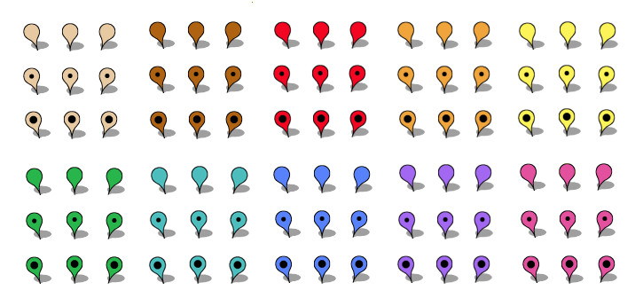
At the lower-left of each icon is a check box. I added this as a convenience if you are creating a map with very many points in one map-making session. You can put a check mark at each icon you've used during a session to keep track of which those are -- so as to not re-use or duplicate icons on your map.

The rest of the information on this page is not necessary to read but may be of interest.
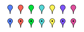
Of balloons, these fourteen are all that's available in Google Maps.

I offer the ninety balloons below.


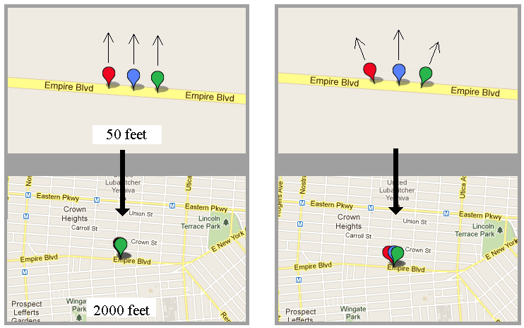
I had an issue with the overlapping of icons as the scale of a map increases -- a way to partially negate this was to make matching sets of three each -- an icon that stands straight up, one that leans to the left and one that leans to the right. As an example, see the three sites below that are literally next door to each other (686, 688 & 690) on Empire Boulevard in Brooklyn, New York. At the 50-foot scale they are all distinct but, at the 2000-foot scale, one icon almost completely obscures the other two. Assigning icons that lean away from each is handy for sites that are relatively close in proximity to each other (and tripled the number of distinct icons to choose from).

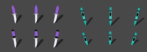
That same remedy for overlapping icons was used on all six sets in this collection and is the "tripling factor". Then there's a "doubling factor" as well in some sets like the purple "Daggers" below, having either a solid color on the handle or having black bands on the ends, and a set with new crayons and used crayons in a turquoise group.

